


Creativity and design, Marketing and communication, SEO, Web optimization
12 tips to organically position your website and generate sales

Aug
The virtual world evolves nonstop, and new resources constantly emerge to make visiting a website much more pleasant, surprising, and even fun. Check out the beautiful websites we’ve gathered.
In this post, we want to give you some tips on the key factors for creating a fantastic user experience so you can achieve your goal: conversion.
1. If they don’t see you, it’s like you don’t exist: positioning.
It’s pointless to have a wonderful website if search engines (Google, Yahoo, Bing, Ask…) don’t recognize it. This may happen due to various issues, for example, if it’s built in Flash or uses frames and JavaScript links, etc. We already know that Flash and the Apple universe never got along—Flash doesn’t display properly on iPads and iPhones, and Google ignores it and doesn’t index it. Does your website use Flash? If so, you should say goodbye to it and opt for the new HTML5, which supports animations, videos, etc.
If you use WordPress, we recommend the Yoast SEO plugin to optimize your website. It allows you to eliminate other plugins like XML Sitemaps, RSS Footer, Robots, or No Index No Follow, because WordPress SEO already includes these features. The fewer plugins you have, the faster your website loads, so it has everything you need.
2. Measure results and act accordingly
What do your users visit most? What day had the most visits? What works and what doesn’t? Measure, reflect, and act based on data. Google Analytics or Google Webmasters are essential for this task. And you might ask why we focus only on Google tools when there are other search engines—because Google accounts for over 90% of search market share. Still, it doesn’t hurt to register on Yahoo & Bing; customers are found in the most hidden places!
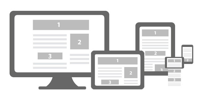
3. Responsive is a must. Period.
Responsive web design is one that adapts to the screen size of the device you’re using to view the website. Over 60% of users browse the internet from mobile devices, and that number keeps growing. Visiting a site that’s not mobile-friendly can be a nightmare—zooming in, trying to tap on menu buttons is uncomfortable. And when it comes to viewing products, it’s a deal-breaker… that’s exactly what happens when we try to browse Conforama’s website… (if Conforama ever modernizes, we’ll gladly remove this paragraph)
But it’s not just about mobile phones—tablets, mini laptops, etc., matter too.
You can check how your website looks on different devices at:
If your company’s website is on WordPress and it’s not responsive, you can try a plugin made for this purpose. Good luck! At Marabelia, we build mobile-friendly websites from the ground up, of course.
4. Not everyone uses your browser—Internet Explorer still exists
We have a website we proudly showcase, but on cousin Luisa’s computer, it appears completely broken—oh, the horror!
You need to thoroughly check how your site and all its pages display in every browser. How?
Here you can see how it looks in Explorer browsers:
In the following link, you can preview your site in iOS and other browsers (registration required):
Don’t forget there are many browsers out there—we tend to think everyone uses the same one as us, but nothing could be further from the truth!

5. We love giant images and minimal (but also big) text
We read vertically, we focus on images and headlines, and only click to read more when something catches our eye. Make it easy for your visitors. It’s like when kids read a storybook—the more pictures it has, the more appealing it is. Or like reading a newspaper—we go straight to the headlines. So, on your homepage, skip the walls of text and expand your content on interior pages.
Play with fonts, sizes, and typefaces. The trend is toward XXL-sized typography.
Looking for beautiful, royalty-free images? Here you’ll find images and other cool stuff.
6. Summarize, prioritize, and highlight
Some websites are almost endless, with menus, submenus, and sub-submenus leading to infinite scrolling pages… The user wants to see what you offer at a glance. Think about what information is most important and essential.
Break down your content into small blocks and emphasize visuals. Remember to use PDF files for users to download longer texts (regulations, announcements, etc.). You can reduce PDF file sizes here online for free. Your pages will be light and elegant!
When we talk about usability, we mean making a website easy to use, where content is just right—not too much, not too little.
For instance, think about how many people will want to contact you after finding you online—make it easy! Your contact page should always be in the main menu. It’s incredibly frustrating to search for a company’s phone number or office location and find it’s mission impossible or it takes more than a minute.
7. To each their own color palette
What do you want to convey? Elegance, quality, professionalism, optimism, creativity? Your website’s design will partly determine your business’s success. Don’t underestimate it—we buy with our eyes. For inspiration, visit Color Hunt and create your own palettes. This topic deserves its own article, which we’ll write soon.
8. Better follow the law!
Let’s get serious—noncompliance can cost you a hefty fine. The rules boil down to three main requirements:
- Legal Notice: All commercial websites must include a legal notice clearly stating the company’s name, tax ID, physical address, email, and phone number.
- Privacy Policy: Does your website have a contact form? Then it must state compliance with data protection laws (LOPD) and proper personal data management.
- Cookie Policy: Do you have a Google Maps embed? Social media plugins? Embedded YouTube videos? Cookies are everywhere—and no, we’re not talking about biscuits. Your site must inform users about cookies and give them the option to accept or reject them. Beware! If the user declines, any installed cookies must be removed—not just announced. Be cautious; many solutions are only “patches” and don’t comply with the law.
9. Never autoplay music—or videos
A website with autoplay music invades our space without permission and can be annoying (late at night, in a library…). If your site requires audio, let users click “Play” themselves.
If you have a video, use subtitles, and allow users to choose whether or not to activate sound.
10. The blog is key to attracting traffic—and you know it.
Content is King for SEO, as long as it’s original, valuable, and solves problems. Think about what your customers care about and get to work—you already know how crucial content is for SEO. Set a publishing schedule—you’ll improve with practice.
If you haven’t updated your site in ages (i.e., over 2 months), you have two choices: update it or remove the post’s publication date. (It’s not lying—it’s just not telling the whole truth.)
11. Social media: from the outside in
What we want is for customers to visit your website and make a purchase, contact you, or whatever your goal is. If your clients are browsing your website and then decide to check out your company’s Facebook page, they might get distracted by a message from their cousin Paco or 30 likes on their latest photo album. That’s not ideal. That’s why, although you should include links to your social media, they should be placed discreetly — in the footer, for instance, and without too much fuss.
On the other hand, when users are already on your social media profiles, every post, every image — and especially any mention of a product — should lead directly to your website, specifically to that product’s page, so they can buy, buy, buy!
12. Plugins: the fewer, the better
Imagine a house with just a table and four chairs — it’s unlikely anything will break even in a hundred years. Now imagine it’s packed with a fridge, washing machine, air conditioner, and Nespresso machine — how long until something breaks down? Plugins are like that. They’re extensions that can clash with each other, be abandoned by developers, introduce vulnerabilities, or add bloated tables to your database. That’s why, unless absolutely necessary, avoid installing plugins recklessly. Always go for the most popular ones with high ratings.
13. Surprise them!
When you’re communicating through a website, you’re engaging in a dialogue with someone on the other side of the screen — so why not give them a wink? The tone you use will depend on your industry and the image you want to project, but try to be creative, direct, and original. Use short sentences. Sometimes a touch of irreverence or wit can hit the mark. Keep in mind that stiff corporate talk is a snooze fest — use honesty and humor to build your multimedia message, and your audience will thank you for it.
So, what are you waiting for to modernize your website? 🙂