


SEO, Web optimization, Wordpress
CSS: Font-size responsive
How to Create a Fully Responsive CSS Style?
Keep this demo example in mind:
.style-x { font-size: calc(1em + 1vw) }
This CSS application is magical
By applying these measurement units for proportionality, you will get sizes that respond to the device width and look good on all screens.
Why are em and vw magical units?
em and vw can be used in any CSS property that we need to make responsive. In particular, we should use them to define all the elements/styles that we want to make adaptable such as margin and padding, and they will also be very useful for proportionality in height and width of background images and container boxes with style.
Next, we will get to know these units well and how to apply them correctly:
font-size: 12px Enough with pixels already! Let’s be responsive!
Let’s start with responsive units of measurement for font-size, margin, padding, etc.
Pixel (px) units, while a good starting point for working in CSS, are not recommended in a responsive environment (adapting to different screen sizes and devices).
To work in a responsive environment, we need to use scalable or adaptive proportions (% and em) and ideally also apply the new CSS3 viewport units (vh and vw), which scale the element according to the screen display properties.
Let’s take a detailed look at all the CSS scaling properties for elements—fixed proportions, scalable proportions, and proportions relative to the viewport size—and how to apply them in our CSS.
1. Fixed Proportions
Pixels (px): Pixels are fixed-size units used for screen media (i.e., for reading on a computer screen).
A pixel equals one point on the computer screen (the smallest division of your screen’s resolution).
Many web designers use pixel units in web documents to create a pixel-perfect representation of their site as it appears in the browser.
One issue with the pixel unit is that it cannot scale up for visually impaired readers or down to fit mobile devices.
Points (pt): Points are traditionally used in print media (anything printed on paper, etc.).
One point equals 1/72 of an inch.
Points are very similar to pixels, as they are also fixed-size units and cannot scale in size.
2. Scalable or Adaptive Proportions
Percentage (%): The percentage unit is very similar to the “em” unit, except for some fundamental differences.
First, the current font size is equal to 100% (i.e., 10 points = 100%).
When using the percentage unit, your text remains fully scalable for mobile devices and accessibility.
“Ems” (em): “em” is a scalable unit used in web document media.
One em equals the current font size; for example, if the document’s font size is 16px, then 1em equals 16px.
ems are scalable by nature, so 2em would equal 32px. The em unit always depends on its parent element. For instance, if the body element has a font size of 16px and a child element has a font size of 1.3em, that text will be displayed 30% larger than the body’s text (20.8px).
One very important thing about the em unit is that it always provides values relative to the element’s font-size. Therefore, we should apply em to properties that need to maintain proportionality with respect to the font-size of a specific style.
In other words, we must always keep in mind that properties defined using em change according to the font-size of the element we are working with.
Rem (rem): The rem unit is very similar to em (as we just saw), with the only difference being that rem
*is not scalable—this means it does not depend on the parent element’s size, but rather on the root element of the document, the HTML element. Rem is a root-based em.
This means that if the HTML element has a font size of 16px (which is the default), then 1rem equals 16px. And if we want to apply a size based on rem to any element on the page, it won’t matter what font size that element has, because 1rem will always equal 16 pixels unless the root element is modified.
That’s why we’re seeing more and more examples using both em and rem simultaneously—even within the same property:
-
Use
emfor properties that change with the element’sfont-size -
Use
remfor everything else
Try testing online with a practical example using em and rem units
3. Proportions Relative to the Viewport Size
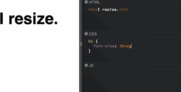
Viewport units (vh and vw):
vh and vw are
length units relative to the viewport (also known as the browser window or graphical screen).
With this new CSS3 integration, you can define sizes for
font-size (as well as padding, margin, and element proportions like images)
that adjust to the width or height of the viewport.
1vh
(1 Viewport Height) refers to one hundredth of the viewport height, and
1vw
(1 Viewport Width) refers to one hundredth of the viewport width.
Therefore:
100vh = 100% of the screen height
100vw = 100% of the screen width
In summary, the vw value indicates the proportionality of a scalable style such as font-size or any other property like padding or height relative to the screen on which it will be displayed.
These units are very useful for:
- Generating large text on big screens and small text on small screens.
- Setting the size of a background image, container frame, or a text box.
We can test these proportional units and their applications with these two Codepen examples:
Example 1 for text:
[codepen_embed height=”265″ theme_id=”0″ slug_hash=”rkhgo” default_tab=”css,result” user=”timseverien”]See the Pen <a href=’https://codepen.io/timseverien/pen/rkhgo/’>Viewport units</a> by Tim Severien (<a href=’https://codepen.io/timseverien’>@timseverien</a>) on <a href=’https://codepen.io’>CodePen</a>.[/codepen_embed]
Example 2 for images:
[codepen_embed height=”265″ theme_id=”0″ slug_hash=”mezEyG” default_tab=”html,result” user=”edwinpgm”]See the Pen <a href=’https://codepen.io/edwinpgm/pen/mezEyG/’>Background Size Cover CSS</a> by Edwin Gonzales Melquiades (<a href=’https://codepen.io/edwinpgm’>@edwinpgm</a>) on <a href=’https://codepen.io’>CodePen</a>.[/codepen_embed]
4. Proportions Relative to Another Proportion
There are two additional measurement units not yet mentioned: vmin and vmax, which are linked to the minimum and maximum of the viewport’s width and height, depending on which is smaller or larger. These units are especially useful for generating square text boxes like:
.box {     height: 100vmin;

width: 100vmin;}
This would cover the full width regardless of the height (it would overflow vertically – off-screen – if necessary)
.box {    height: 100vmax;

width: 100vmax;}
This would cover the full height regardless of the screen width (it would overflow horizontally – off-screen – if necessary)
*I’ve left out a more detailed explanation because its use is more occasional and only applies to very specific cases.
Conclusions and Practical Example
Understanding everything above, we will see that by creating a style-x with the following attributes:
.style-x {

font-size: calc(1em + 1vw);

line-height: 1em;

padding: 1em;

margin: 1em;}
- If we replace the value [1] with the desired proportion (for example, 0.8em for a smaller size; or 1.5em for a larger size), we can generate a fully controlled responsive text style for responsive versions.
- If we want to scale the size according to the width of the viewing device, we will replace the [1] value of vw with a higher or lower number, for example 0.5vw or 1.8vw.
- We can also replace the vw value with [vh] if the reference is the height of the viewing device.
- We will replace em with rem in those variables where we do not want to apply the em proportionality of the font-size.
With this, we now have ALL the necessary knowledge to create responsive styles without limits and with their variables fully controlled.
If you liked the article, please comment or share. Thank you! 🙂