


Creativity and design, Wordpress
How to modify and style image alt and title tags (Help-up descriptions in WordPress)

Nov
Inexperience often leads us to unnecessarily complicate our lives. It happened to us some time ago while trying to figure out how to change the style of the yellow tooltip box (alt or title) that provides more information about an image when you hover over it.
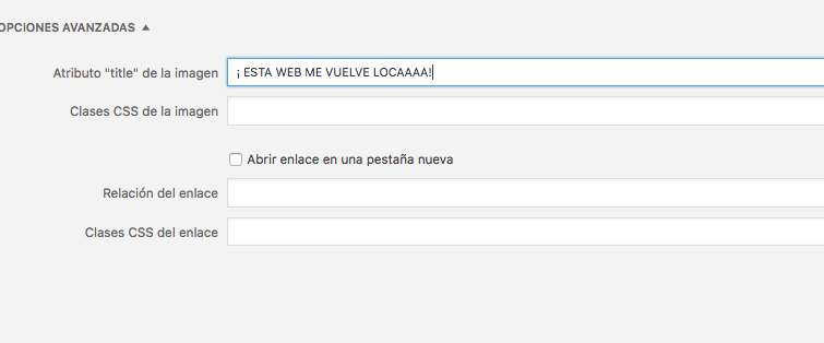
In WordPress, the hover text for an image is added by typing in the title attribute field within the image’s advanced options:
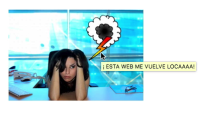
As a result, when we hover over the image, we get that text inside the aforementioned yellow box:
1. HOW TO MODIFY THE CSS STYLE OF THE YELLOW BOX: TOOLTIP
What we wanted to do was replace that yellow box with a stylish and customized bubble, fully configurable with CSS…
We searched online for information, but most of it was confusing and didn’t lead to any clear solution… However, we had seen this somewhere before! It couldn’t be that hard!
And it wasn’t! We were simply searching the wrong way. We should have started by typing “tooltip” or what is more commonly known as a [simple_tooltip content=’It can also be called a help bubble… Aren’t I cute?’] TOOLTIP[/simple_tooltip] (Hover over the pink link!). Once we knew exactly what we wanted to change, everything became much easier.
Within the WordPress plugin repository, there are many free plugins to generate these tooltips. They’re not only useful for changing the style of image tooltips, but also to create descriptive bubbles for text, links, or any type of graphic element.
For its simplicity and versatility, we recommend the plugin Simple Tooltips: https://es.wordpress.org/
2. SIMPLE TOOLTIPS CONFIGURATION
Its configuration is very simple.
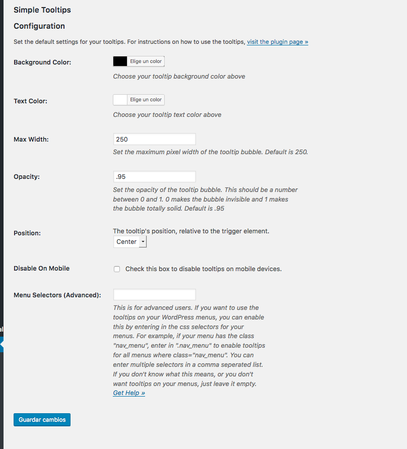
We install and activate the plugin, then go to settings:
We configure its options: Background, text color, max width, opacity, position (location of the balloon relative to the image: right, left, or center), disable on mobile (checkbox to decide if you want to deactivate it on mobile devices), and menu selectors (with a link to the tutorial explaining how to insert tooltips in the main menu of your website):
These would be the default values for our tooltips, but it doesn’t matter, because we can also assign new values to the individual tooltips we create.
3. WHAT CODE TO USE AND HOW TO INSERT IT
To insert a simple tooltips tooltip into an image, we can do it in several ways:
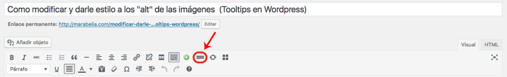
3.1.1. The easiest way is to click the tooltip icon that appears in the WordPress visual editor:
3.1.2. Or manually inserting the basic code:
Example 1 (In the visual editor):
[simple_tooltip content=’THIS WEBSITE IS DRIVING ME CRAZY!’]THIS TEXT TRIGGERS THE BUBBLE![/simple_tooltip]
[ simple_tooltip content='THIS WEBSITE IS DRIVING ME CRAZY!']THIS TEXT TRIGGERS THE BUBBLE![ /simple_tooltip ]
Example 2 (In the HTML editor):
[simple_tooltip content=’THIS WEBSITE IS DRIVING ME CRAZY!’] [/simple_tooltip]
[ simple_tooltip content='THIS WEBSITE IS DRIVING ME CRAZY!' ]<img src="http://any-image.png">[ /simple_tooltip ]
3.2. By inserting the code manually, we can add inline styles to our bubble:
Example 3:
[simple_tooltip bubblewidth=’200′ bubbleopacity=’0.8′ bubblebgcolor=’#f23763′ bubbleposition=’right’ bubblecolor=’white’ content=’THIS WEBSITE IS DRIVING ME CRAZY!’]THIS TEXT TRIGGERS THE BUBBLE[/simple_tooltip]
[ simple_tooltip bubblewidth='200' bubbleopacity='0.8' bubblebgcolor='#f23763' bubbleposition='right' bubblecolor='white' content='THIS WEBSITE IS DRIVING ME CRAZY!']THIS TEXT TRIGGERS THE BUBBLE[ /simple_tooltip ]
Example 4:
[simple_tooltip style=’background:#f23763;color:white;’ content=’THIS WEBSITE IS DRIVING ME CRAZY!’ ]THIS TEXT TRIGGERS THE BUBBLE.[/simple_tooltip]
[ simple_tooltip style='background:#f23763;color:white;' content='THIS WEBSITE IS DRIVING ME CRAZY!' ]THIS TEXT TRIGGERS THE BUBBLE.[ /simple_tooltip ]
3.3. Adding the tooltips class to the target HTML element
This method can also be useful due to its versatility. By adding the tooltips class to the target element, we can create a tooltip in any part of the site we want. Let’s see some real and practical examples of tooltips in different areas of the website.
Example 6:
I’m a link with tooltips
<a title="THIS WEBSITE IS DRIVING ME CRAZY!" class="tooltips" href="#">I’m a link with tooltips</a>
Example 5:
<img class="tooltips" title="GROAOOOO!" src="https://path-to-image.png" alt="marabelia" width="300" height="48" />
Example 6:
I’m a whole paragraph with tooltips. Lorem ipsum dolor sit amet, consectetur adipiscing elit, sed do eiusmod tempor incididunt ut labore et dolore magna aliqua. Ut enim ad minim veniam, quis nostrud exercitation ullamco laboris nisi ut aliquip ex ea commodo consequat. Duis aute irure dolor in reprehenderit in voluptate velit esse cillum dolore eu fugiat nulla pariatur. Excepteur sint occaecat cupidatat non proident, sunt in culpa qui officia deserunt mollit anim id est laborum.
<p class="tooltips" title="THIS WEBSITE IS DRIVING ME CRAZY!">I’m a whole paragraph with tooltips. Lorem ipsum dolor sit amet, consectetur adipiscing elit, sed do eiusmod tempor incididunt ut labore et dolore magna aliqua. Ut enim ad minim veniam, quis nostrud exercitation ullamco laboris nisi ut aliquip ex ea commodo consequat. Duis aute irure dolor in reprehenderit in voluptate velit esse cillum dolore eu fugiat nulla pariatur. Excepteur sint occaecat cupidatat non proident, sunt in culpa qui officia deserunt mollit anim id est laborum.</p>
4. ADDING TOOLTIPS TO OTHER EXTERNAL ELEMENTS
4.1. TOOLTIP TEXT IN CONTACT FORM (WITH CONTACT FORM 7)
Now that we’ve seen the different ways to activate our tooltips, let’s apply this effect to elements outside of the WordPress visual/html editor. For example, we think it’s very useful to include it in contact forms to provide users with more information. To do this, we’ll use the form generator Contact Form 7.
We create a new form and, by default, we have this configuration:
<label> Name (required)
[text* your-name] </label>
<label> Your email (required)
[email* your-email] </label>
<label> Subject
[text your-subject] </label>
<label> Message
[textarea your-message] </label>
[submit "Send"]
We’ll replace the default configuration with this:
<p class="tooltips" title="Enter your real name">Name:  [text* your-name]</p>
<p class="tooltips" title="Enter a valid email address">E-mail:  [email* your-email]</p>
<p class="tooltips" title="What is this about?">Subject:  [text your-subject]</p>
<p class="tooltips" title="Keep it brief and use punctuation marks">Message:    [textarea your-message] </p>
<p class="tooltips" title="The file can't be larger than 2 GB! Don't overdo it!">If you want, you can attach a file:
[file file-817]</p>
[submit "SEND"]
With this sample code, we’ll get a contact form like the one we saw above.
Now let’s improve the appearance of our form by integrating the placeholder text inside the input fields and also including tooltip descriptions:
[contact-form-7 id=”8202″ title=”blog tooltips”]
It’s as simple as this:
<p class="tooltips" title="Enter your real name">[text* text-297 "Name"]  </p>
<p class="tooltips" title="Enter a valid email address">[email email-829 "e-mail"] </p>
<p class="tooltips" title="We’re going to call you! Ring!">[tel tel-165 "Phone"] </p>
<p class="tooltips" title="Where are you from?">[text text-7 "City"] </p>
<p class="tooltips" title="What do you want?">[select menu-322  "I want to request a quote" "I want to work/collaborate with you" "I want to ask something..."]</p>
<p class="tooltips" title="Explain yourself while you still can!">[textarea textarea-424 3x6/300  "Tell us more"]</p>
<p class="tooltips" title="Go for it!"> [submit "SEND"]</p>
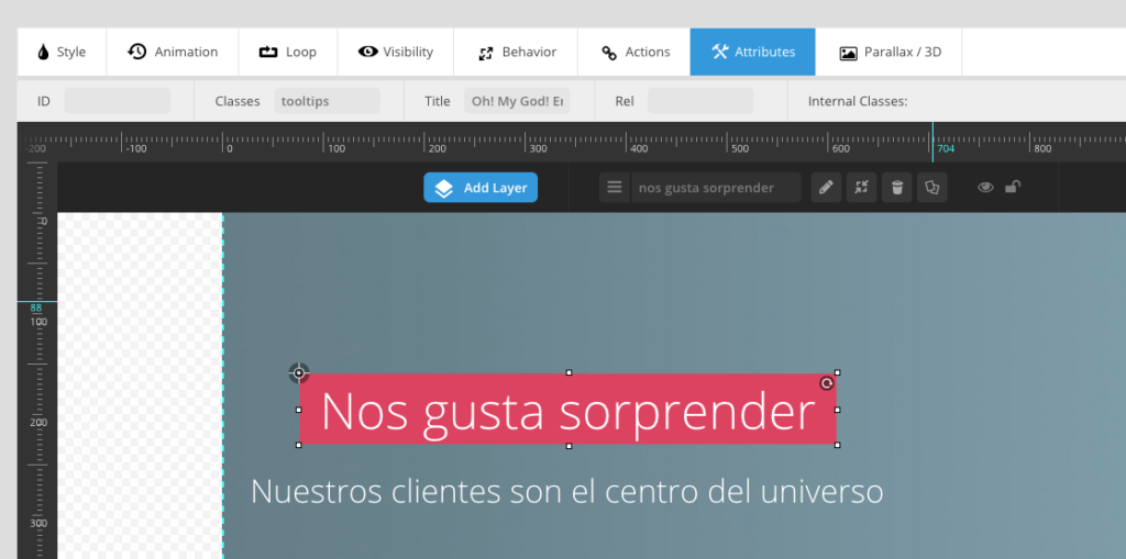
5. TOOLTIPS IN SLIDER REVOLUTION (Easy Coordinate Maps)
We’re going to apply an example of tooltips in a slider — in this case, we’re using Revolution Slider from Envato, which we believe is the best plugin on the market for creating slides due to its features. Although Layer Slider is also quite good and allows us to perform almost the same actions. Let’s take a look at an example:
With everything we’ve learned, adding tooltip elements to our slider is extremely easy — and it’s a quick way to create interactive coordinate maps on images:
-
We add a new layer and insert the element (text or image) that we want to display a tooltip.
-
With the element selected, go to the Attributes tab and type tooltips in the Classes field. Then, in the Title tab, enter the text you want to appear as a tooltip.
-
Save the slide and insert it. Voilà! That’s it!
We’ve now seen several uses for tooltips, but in future chapters we’ll show you even more examples. We hope this article has been helpful.
If you have any questions, feel free to leave a comment!
Thanks for reading!