

A new identity for Clínica Millet
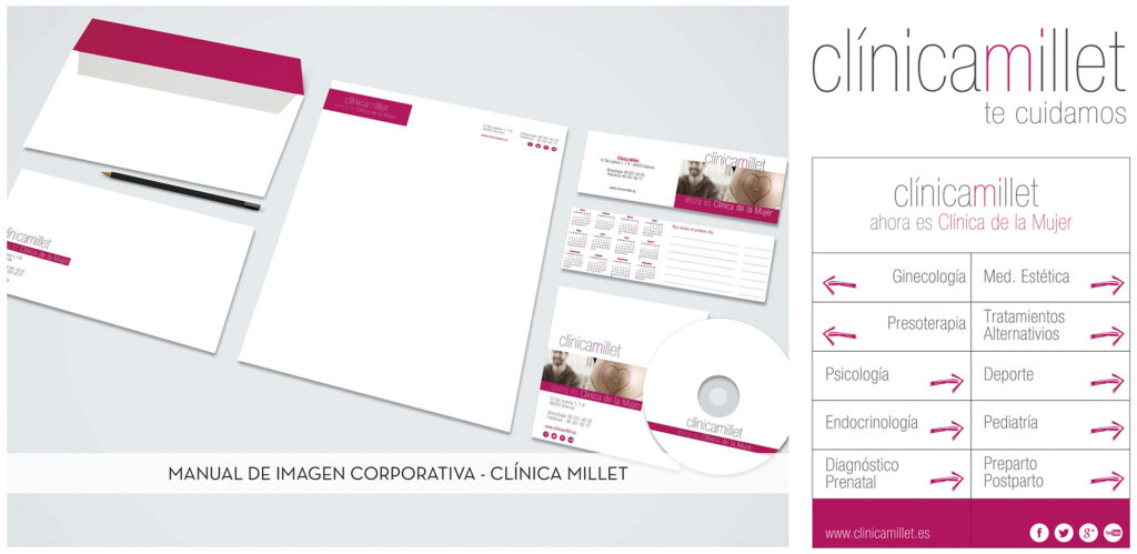
Clínica Millet wanted to refresh its image and strengthen its positioning as a women’s health clinic. We redesigned the logo around the initials CM and a concept developed with the client, creating a clearer, more contemporary and recognisable identity.
The symbol as a starting point
The synthesis of the two letters creates a compact, versatile icon. We refined its proportions, legibility and balance so that the identity would work equally well in corporate communication and across the clinic’s everyday touchpoints.
Signage and graphics for the space
Following the refurbishment, the identity was extended into the physical environment. We designed the signage and wayfinding to provide clarity, maintain visual consistency and make every point of contact part of the same brand experience.
Graphic design with continuity
The project connects identity, applications and communication so the logo never exists in isolation. Our graphic design and corporate identity work creates systems that adapt to interiors, printed materials and digital channels without losing personality.